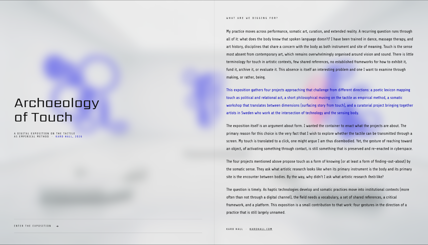
Concept
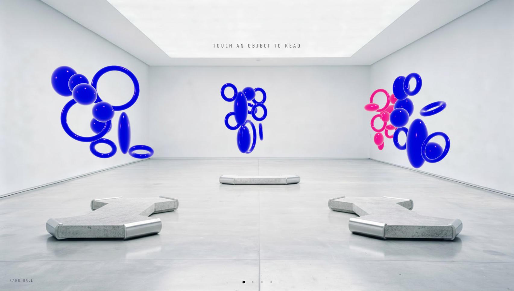
This project represents ongoing research into tactile experience as empirical methodology, here expressed through digital tools. An interactive 3D gallery that adopts a white cube aesthetic and asks visitors to do something galleries rarely allow: touch things.
The exposition addresses a significant gap. Touch and the tactile is the sense most absent from contemporary art, which remains overwhelmingly organized around vision and sound. There are no established frameworks for exhibiting, funding, archiving, or evaluating tactile art. This project is part of an initiative to build a framework for haptic and somatic art.
What are we digging for?
Live Exposition
The full interactive experience is hosted online. Explore the 3D gallery at karohall.github.io/archaeologyoftouch
The Four Components
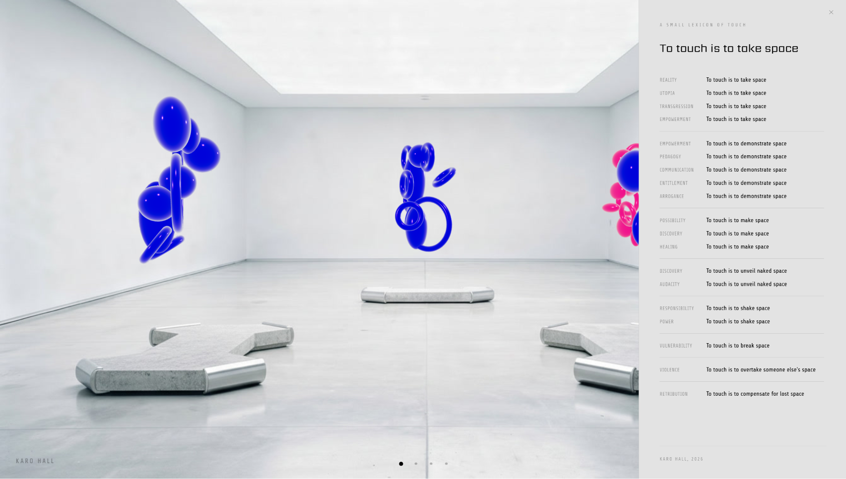
- A poetic lexicon mapping touch as a political and relational act
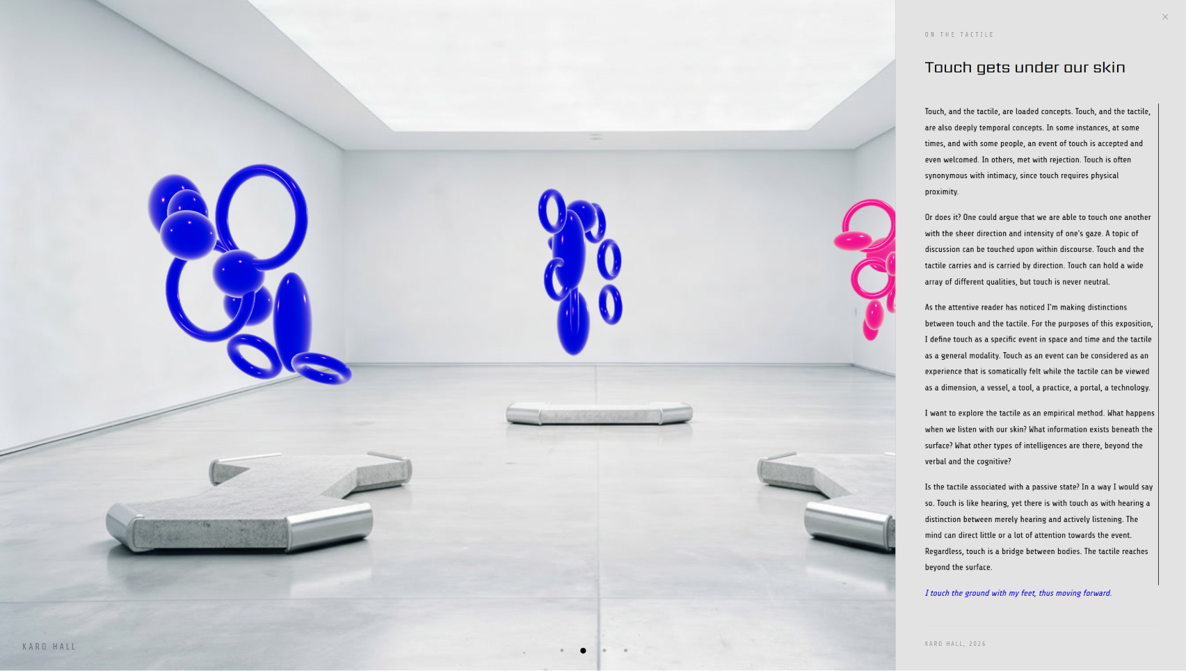
- A philosophical essay on tactile empiricism
- A somatic workshop translating between physical and digital dimensions
- A curatorial project featuring Swedish artists working with technology and sensing bodies. Read more about Body of Work here
Design Approach
The container as argument
To navigate the space, the visitor must touch the objects. Yet the gallery is digital, and the objects virtual. Can they really be touched? The question is the point. By requiring physical interaction with 3D objects, the interface enacts the argument it's making.
The environment was built to feel generic, and backgrounds were generated using Flux AI with prompts like "bank foyer" and "airport terminal". The effect is an uncanny white cube that unsettles the expectation of passive observation.
Material Decisions
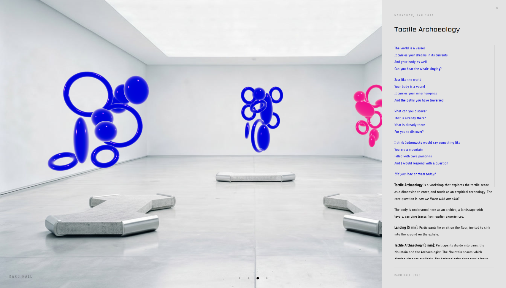
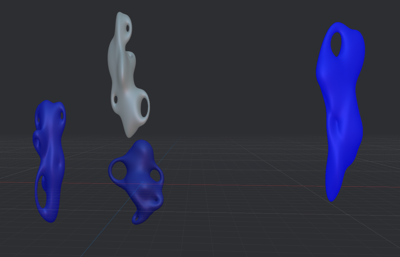
Glossy, alien, ceremonial
Initial sketches of 3D blob forms were made in Spline, inspired by ancient ceremonial vessels while maintaining something deliberately alien. Due to a tight deadline, the forms remained as tori and globes.
A glossy finish was prioritised throughout. The glossy aesthetic functions as a cheeky nod to the commodified art world of the 21st century, surfaces that reflect you back at yourself, that invite touch by looking untouchable.
Reflection
When form overshadows function
Working without predetermined constraints surfaced a tension familiar to design practice: the pull between aesthetic intention and usability. The original scale is 1920×1080 and unfortunately, the website doesn't scale well. Significant time was spent on form (placement of instructions, interaction cues, navigation logic...) before usability was treated as an equal concern.
The project is an honest record of that negotiation. It reflects on what it means to design an interface when you're also the one defining what the interface is for. In this case, I wanted to make things pretty.